Examples
Civic Translator transforms lengthy public meeting materials into visual, easy-to-understand resources that help residents quickly understand what happened, why it matters, and how local government decisions are made. The platform automatically adapts its analyses for regular board meetings, workshops, advisory committees, study sessions, and other public meetings.
The examples below demonstrate several ways Civic Translator can help parents, taxpayers, staff, students, journalists, elected officials, and community members better understand public meetings and make more informed decisions.
🏫 School Board Packet Analysis
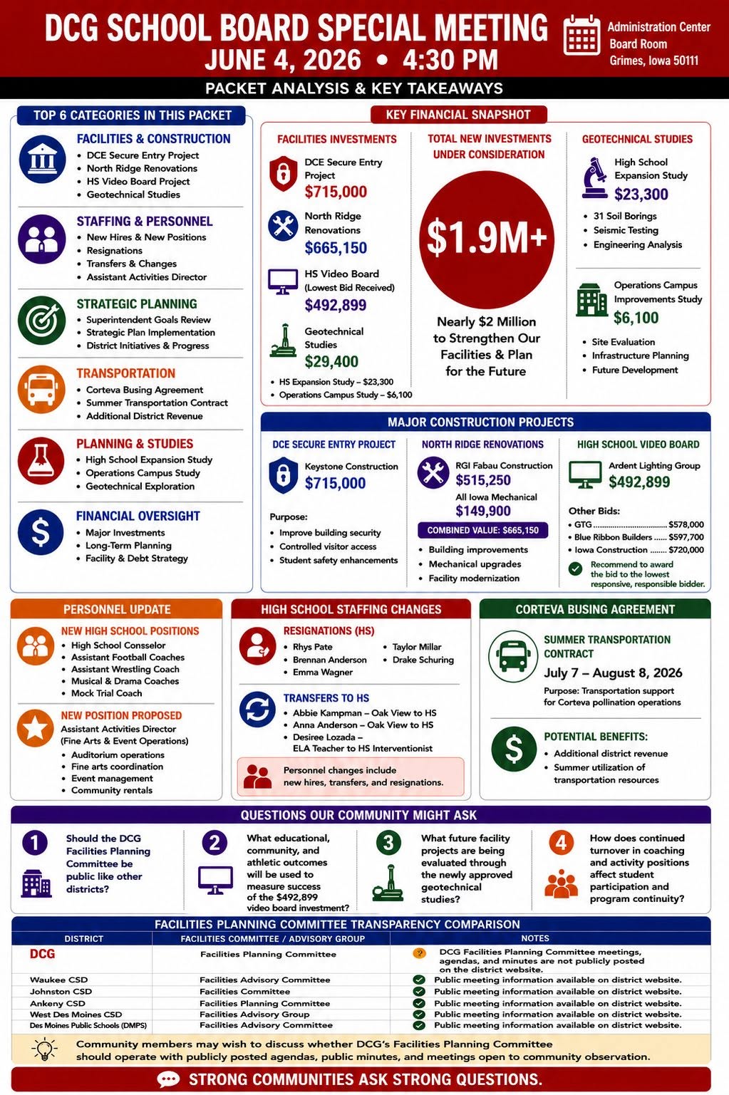
Packet analyses summarize large board packets before meetings occur, allowing residents to quickly understand upcoming agenda items, proposed policies, financial decisions, contracts, personnel recommendations, curriculum changes, construction projects, and other significant topics.
Rather than reading hundreds of pages, residents can review a concise visual overview that highlights the most important issues likely to be discussed during the meeting.
🧑🏫 Workshop & Committee Meeting Analysis
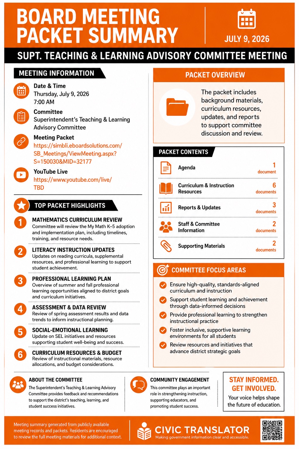
Not every public meeting is a traditional board meeting. Civic Translator automatically adapts its summaries for workshops, advisory committees, policy committees, facilities committees, curriculum committees, and other non-voting meetings while preserving the same professional editorial layout.
Rather than emphasizing votes or formal board actions, these infographics highlight committee discussions, staff presentations, planning activities, recommendations, issues under review, and future work, providing residents with a clear understanding of ongoing decision-making before matters reach the full board.
🎤 School Board Meeting Analysis
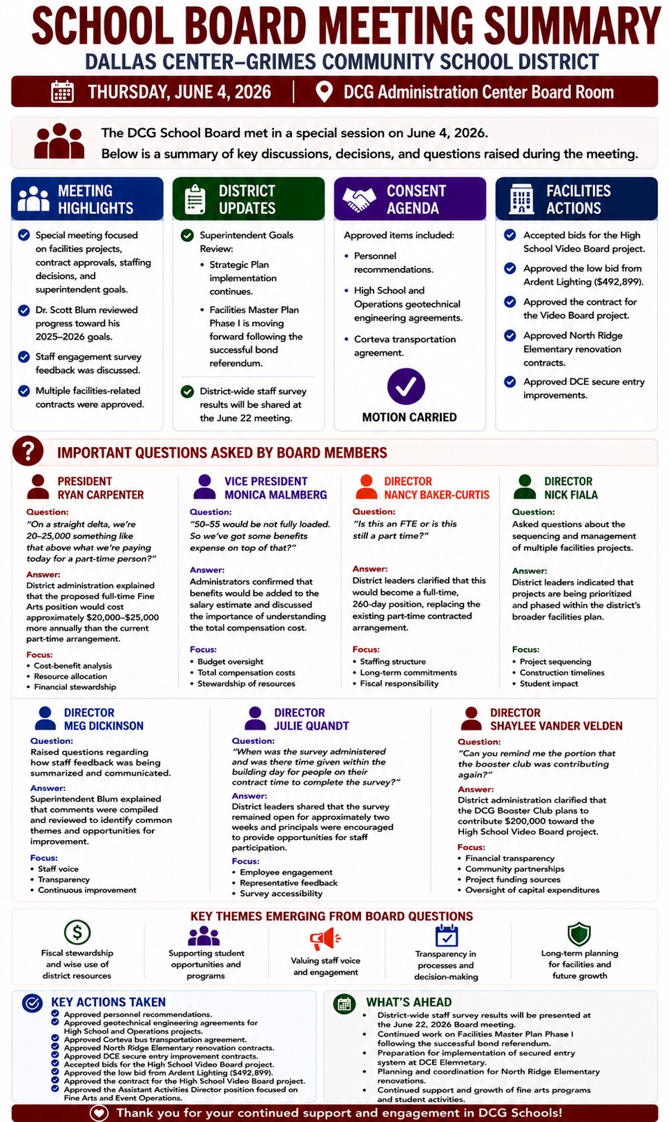
Meeting analyses summarize completed public meetings by highlighting major presentations, board discussions, committee recommendations, financial decisions, policy actions, planning activities, and questions raised during the meeting. The layout automatically adapts based on the type of meeting being summarized.
These summaries help residents quickly understand what happened without needing to watch several hours of video or read lengthy transcripts.
📊 Multiple School District Comparison
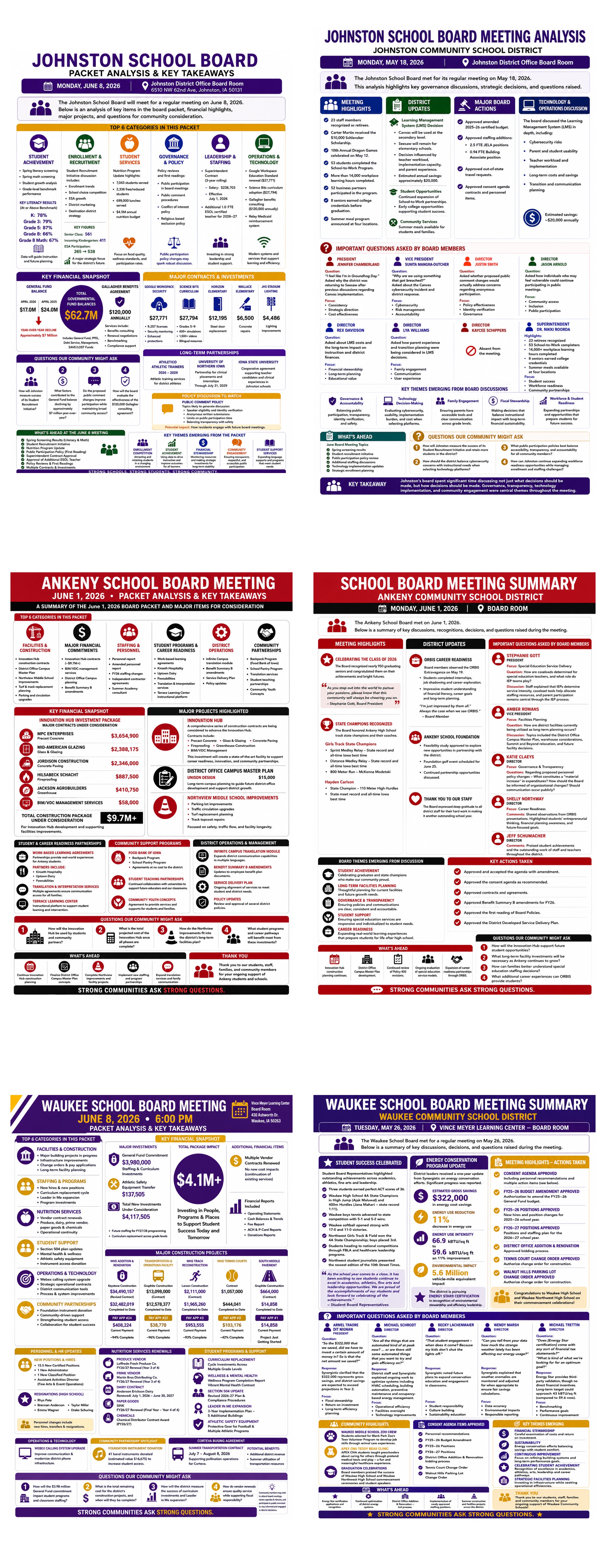
Comparative reports combine information from multiple districts to identify trends, similarities, differences, governance practices, student representation, spending priorities, and policy decisions.
These reports help communities learn from neighboring districts and provide valuable context for local decision making.
🗺️ Decision Flow Diagram
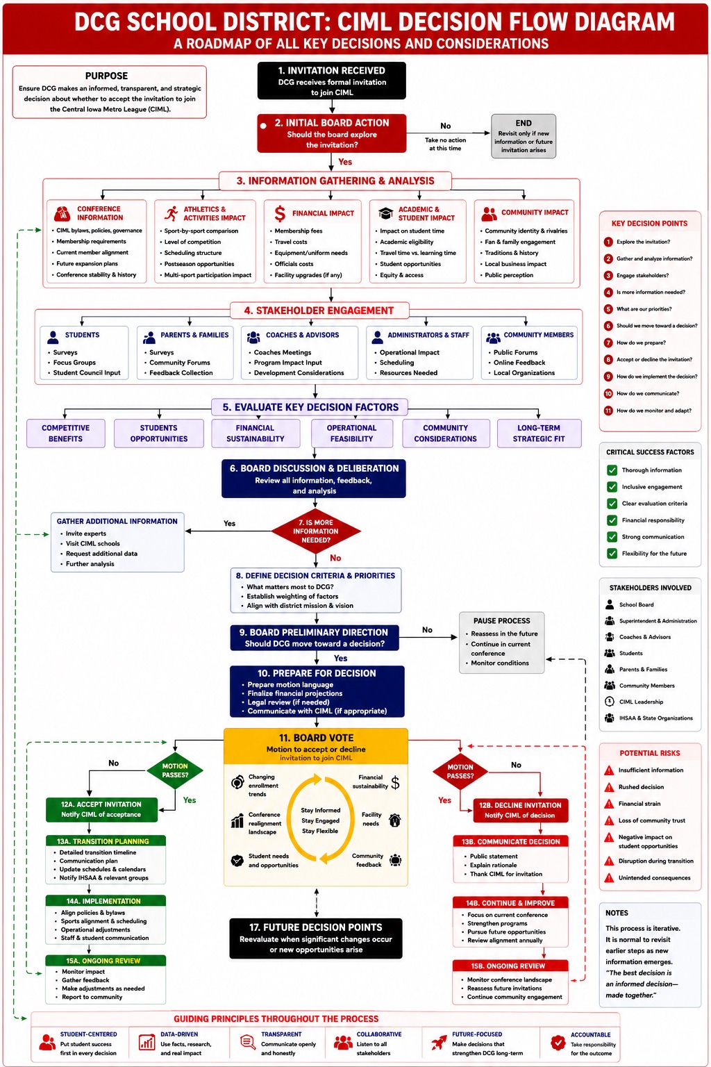
Decision flow diagrams illustrate how an issue moves through the decision-making process—from staff recommendations and committee discussions to board deliberation, public input, voting, and final implementation.
These visual workflows help residents understand not only what decision was made, but also how that decision reached the board and where opportunities for public participation exist.
📋 Decision Matrix
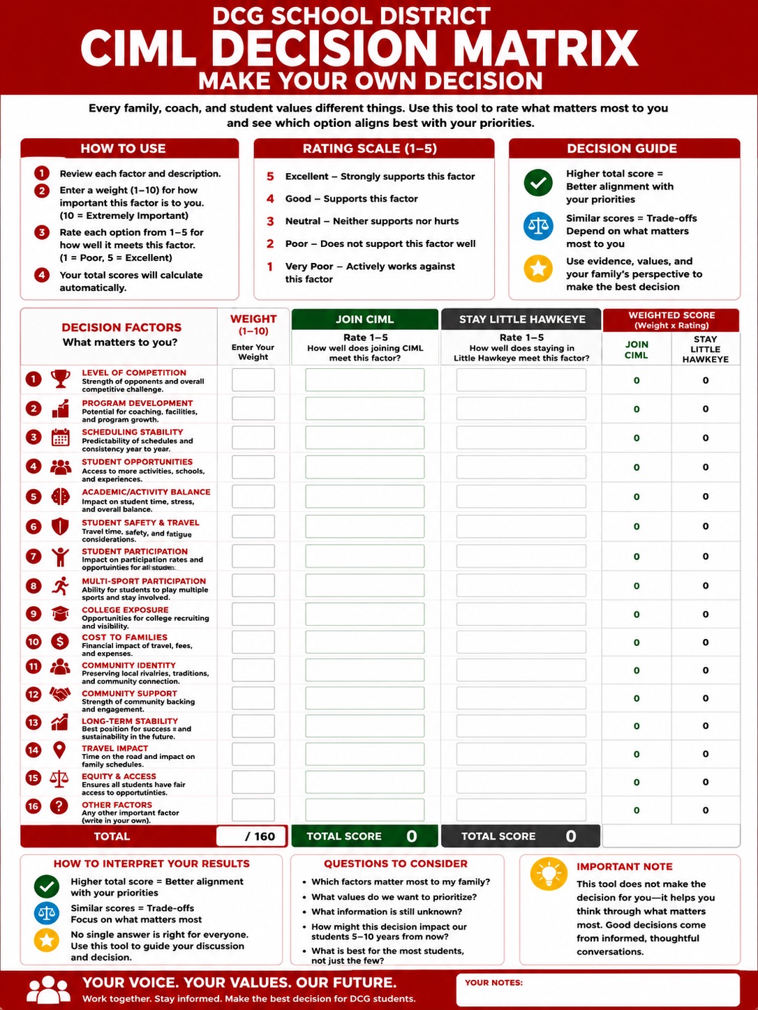
Decision matrices organize complex board decisions into an easy-to-read comparison showing available options, advantages, disadvantages, estimated costs, stakeholder impacts, risks, and the final recommendation.
This format makes complicated decisions far easier to understand and provides residents with additional transparency into how major recommendations are evaluated.